Trade Deficit vs Exchange Rate Curve
Description of the problem
I once remember reading an old paper by an economist (whose name escapes me) about relationship between trade deficit and exchange rates. Today, I’ll do a numerical experiment to see if there is a demonstrable relationship.
Data
I am going to pull the data from European Central Bank. Let us start with the libraries:
import json
import pandas as pd
import numpy as np
from matplotlib import pyplot as plt
from urllib.request import urlopen
I am going to rehash a function I wrote earlier to pull the data:
def ecbProbe(dataset,name,m):
    mid = ':'.join(['0' for i in range(m)])
    with urlopen(f'https://sdw-wsrest.ecb.europa.eu/service/data/{dataset}?format=jsondata') as url:
         raw = json.load(url)
    dates = [x['name'] for x in raw['structure']['dimensions']['observation'][0]['values']]
    values = [x[0] for x in raw['dataSets'][0]['series'][mid]['observations'].values()]
    return pd.DataFrame({name: values}, index=dates)
I am going to pull the full data of total imports and exports of EU Area with the US:
country = 'US'
df1 = ecbProbe(f'ECB,TRD/M.I8.Y.M.TTT.{country}.4.VAL','imports US',8)
df2 = ecbProbe(f'ECB,TRD/M.I8.Y.X.TTT.{country}.4.VAL','exports US',8)
deficit = pd.DataFrame(df1['imports US']/df2['exports US'])
deficit.plot(figsize=(12,6))
plt.savefig('us-ec-trade-deficit.png')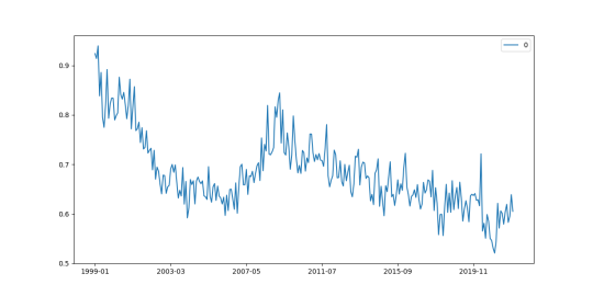
Next, the exchange rate data:
exchangeUStoEUR = ecbProbe('EXR/M.USD.EUR.SP00.A','EURXUS',5)
exchangeUStoEUR.plot(figsize=(12,6))
plt.savefig('us-ec-exchange-rate.png')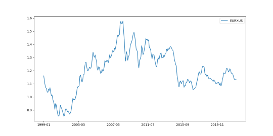
Now, we plot these things against each other. I’ll do a running average of 8 months.
tmp = deficit.join(exchangeUStoEUR,how='inner').rolling(8).mean()
plt.plot(tmp.iloc[:,0],tmp.iloc[:,1])
plt.savefig('us-ec-plot.png')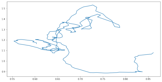
Analysis
Interesting!