Working with World Bank Data in Python
Description of the problem
I have been working with European Central Bank data in python. I am teaching two data science classes this semester and I need a good source of real socio-economic data for teaching purposes. World Bank is such a good source. Today, I am going to write two python functions to query the World Bank Data Store.
Implementation
Let me start with the imports:
import pandas as pd
import numpy as np
import matplotlib.pyplot as plt

from io import BytesIO
from urllib.request import urlopen
from zipfile import ZipFile
from xmltodict import parse
My first function pulls the data from World Bank Data store in xml and converts to a hash map:
def queryWorldBank(series):
    base = 'https://api.worldbank.org/v2/en/indicator/'
    with urlopen(f'{base}/{series}?downloadformat=xml') as url:
        zf = ZipFile(BytesIO(url.read()))
    name = zf.filelist[0].filename
    return parse(zf.open(name).read().decode('utf8'))
The next function parses the raw xml we pull from the data source:
def parseXML(rawXML, name):
    res = []
    years = []
    for x in raw['Root']['data']['record']:
        y = x['field']
        try:
            res.append({'country': y[0]['#text'],
                         name: float(y[3]['#text'])})
            years.append(int(y[2]['#text']))
        except:
            None
    return pd.DataFrame(res, index=years)
Each data set on World Bank’s Data Store has a unique ID. For example, the store has data that contains the number of air passengers (both domestic and international) carried by the air carriers registered in the country. The unique id for the data set is “IS.AIR.PSGR”. The records indicates that the data came from International Civil Aviation Organization.
raw = queryWorldBank('IS.AIR.PSGR')
passengers = parseXML(raw,'passengers')
(passengers[passengers['country']=='Turkey'])['passengers'].plot(figsize=(18,6))
plt.savefig('world-bank-data-figure-1.png')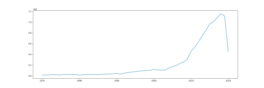
Next, let me pull the gini index data, and I’ll plot the data for Turkey.
raw = queryWorldBank('SI.POV.GINI')
gini = parseXML(raw,'gini')
(gini[gini['country']=='Turkey'])['gini'].plot(figsize=(18,6))
plt.savefig('world-bank-data-figure-2.png')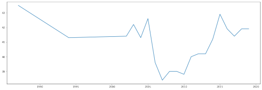
Next, I’ll pull the data on the number of years schooling received by 15+ year old women. The ID for that data set is “BAR.PRM.SCHL.15UP.FE”.
raw = queryWorldBank('BAR.PRM.SCHL.15UP.FE')
education = parseXML(raw,'level')
(education[education['country']=='Turkey'])['level'].plot(figsize=(18,6))
plt.savefig('world-bank-data-figure-3.png')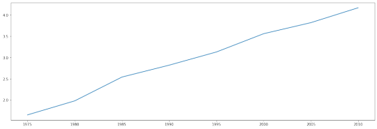
How about we plot average gini against average year of schooling 15+ year old women get for each country:
ed = education.groupby('country').mean()
gi = gini.groupby('country').mean()

res = ed.join(gi,how='inner')

plt.figure(figsize=(8,8))
plt.scatter(res['level'],res['gini'],c='blue',alpha=0.3)
plt.savefig('world-bank-data-figure-4.png')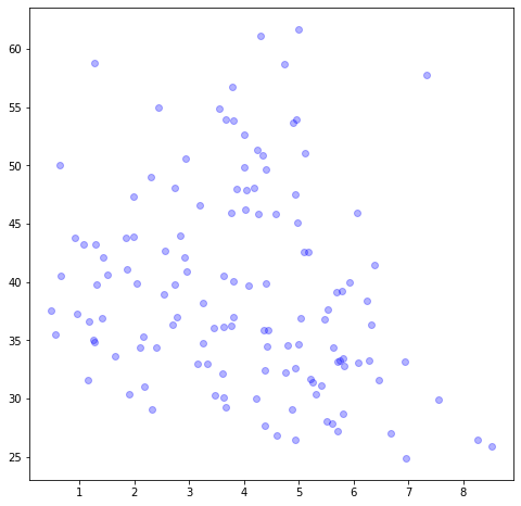
Do you notice something? The gini index (a measure of economic
inequality) reduces as the average number of schooling of women 15+
increases. Something to ponder about.